EVERYTHING IN THIS NEWSLETTER IS BASED UPON WHAT I AM HEARING FROM PEOPLE I TRUST. PLEASE DO NOT MISTAKE THIS FOR FACT OR FOR ACTUAL JOURNALISM, WHICH HAS VERIFICATION STANDARDS THAT I HAVE NOT ADHERED TO. I DO NOT GUARANTEE THE ACCURACY OF THE CONTENT.
I'm starting this hearing with an objectionably factual statement: Circus>Trajan.
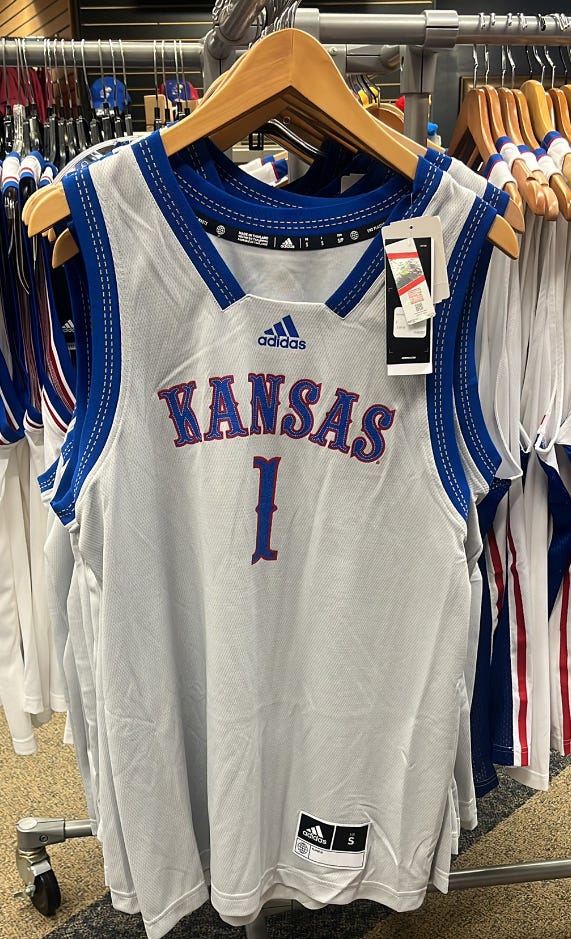
I'm HEARING Kansas will wear a gray version of the classic circus font jerseys for Thursday's game against Harvard. And there's a not-so-distant future where the Jayhawks could return to the classic look full-time. I'll get to that in a minute.
For now, you can see the gray-based jerseys with blue trim floating around the internet for sale. I feel confident saying they look MUCH better in person than they do online.
Photo via SCOOPSMAFIA member @Arc23Bogus on Twitter. Thank you!
I've heard for a while now that KU is open to returning to circus font after NEXT season. Travis Goff and his staff know Circus is generally preferred by fans and seem willing to make a change for the 2024-25 season.
Beyond that, I've heard Bill Self favors Circus font to the Trajan style that's existed most of his time at KU. I can't say anything is official, but if Bill wants it, KU will probably get it.
For now, we'll rely on the spinoff alternates for one or two games a year.
BONUS HEARING: A while back I caught wind of an alternate crimson jersey for KU this season or next. I haven’t seen or heard anything, but remain on the lookout for some Reds.


I love Circus, but Trajan has been the font far longer in Self's tenure.
Let’s go!!!